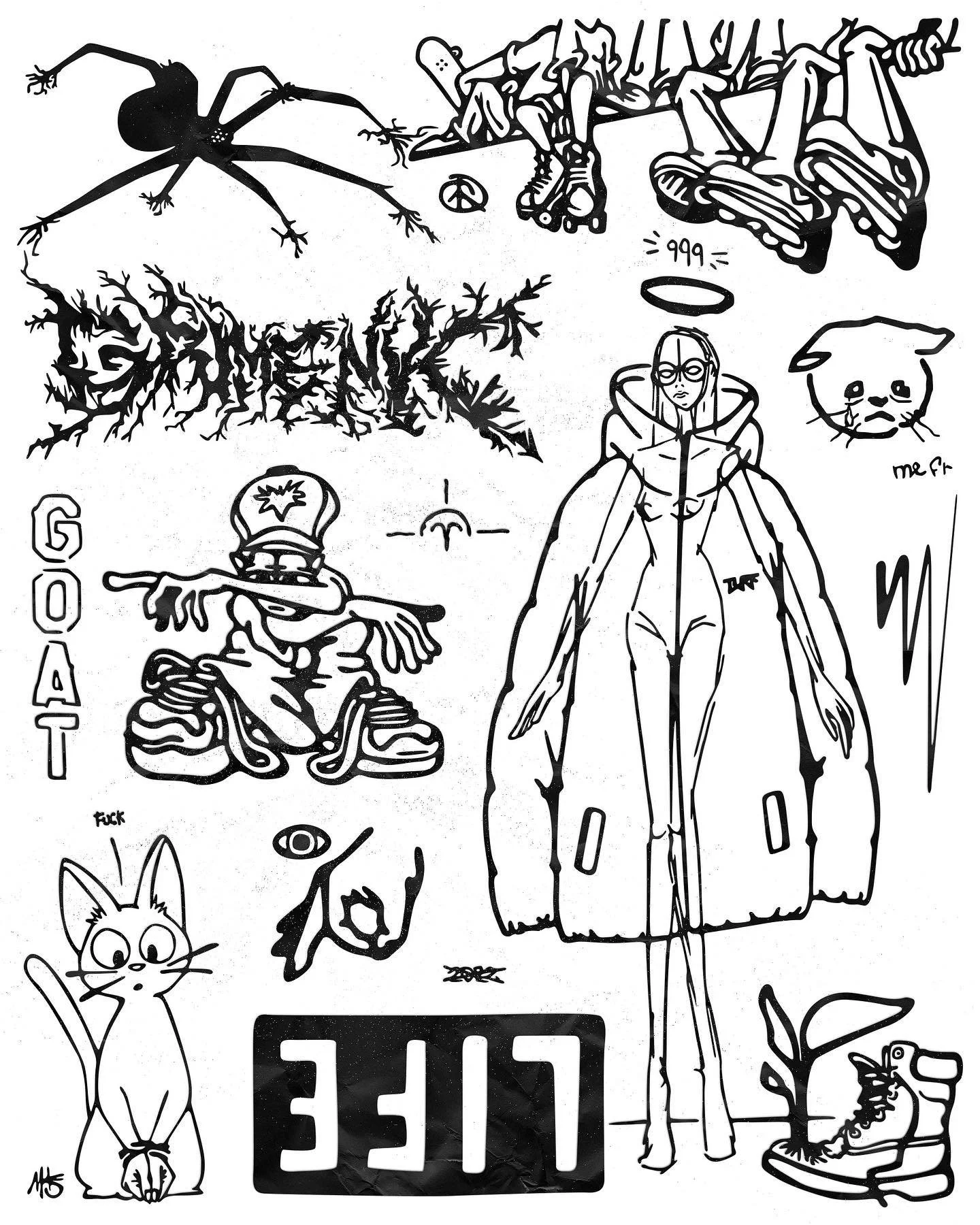
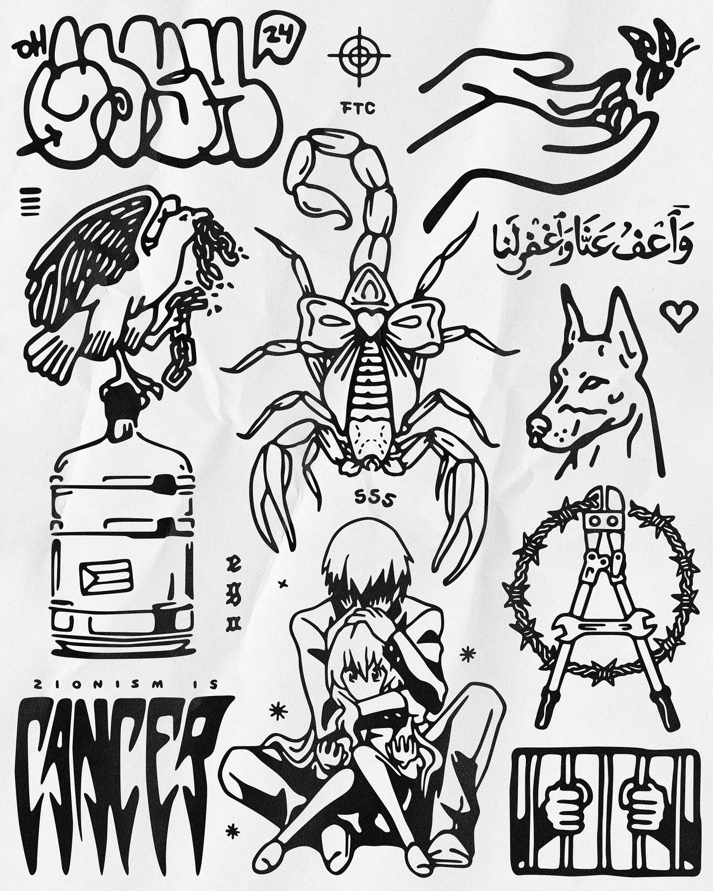
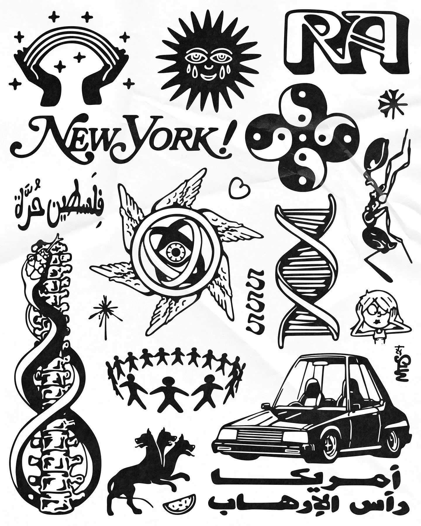
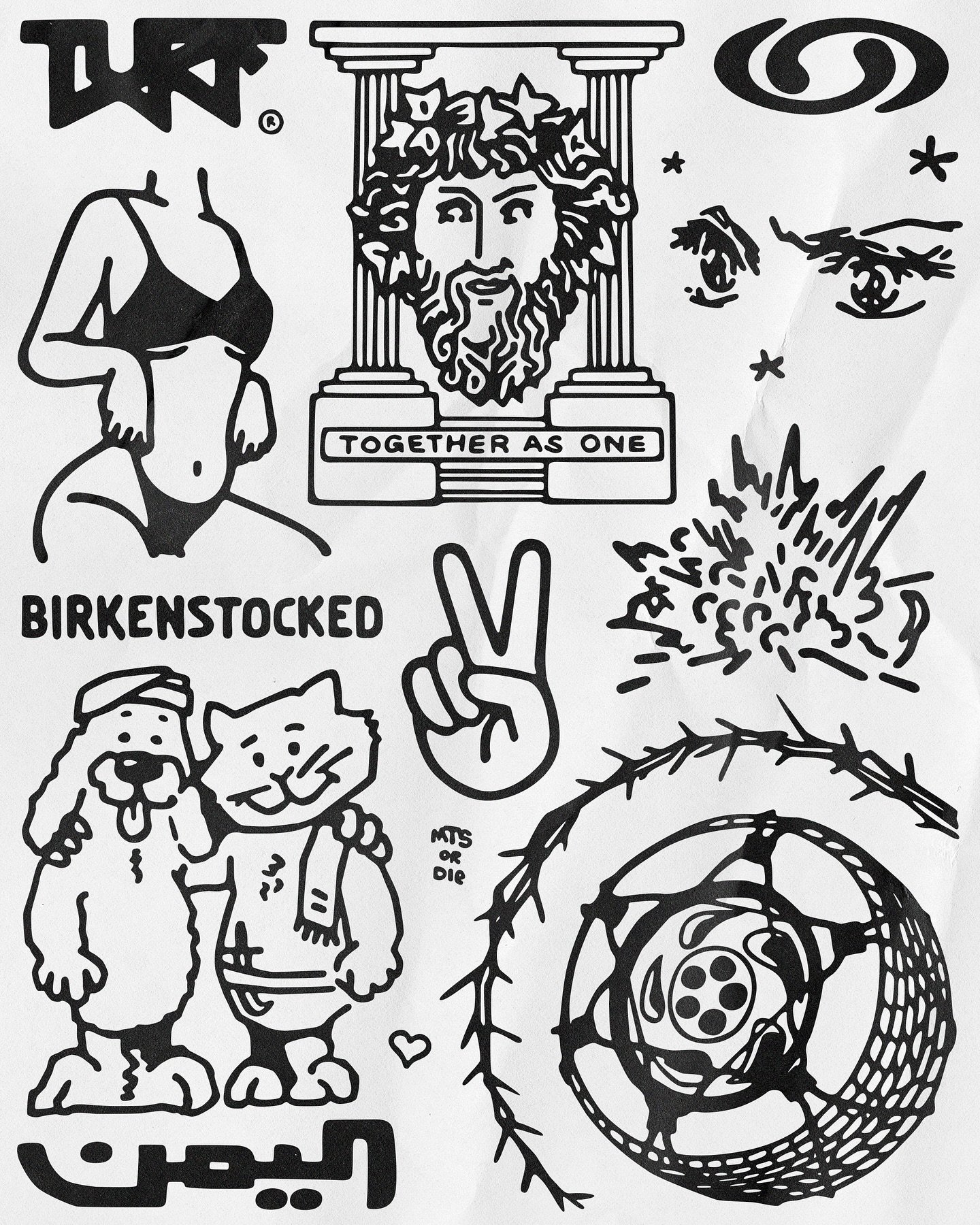
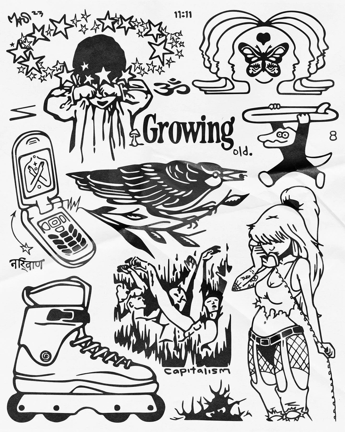
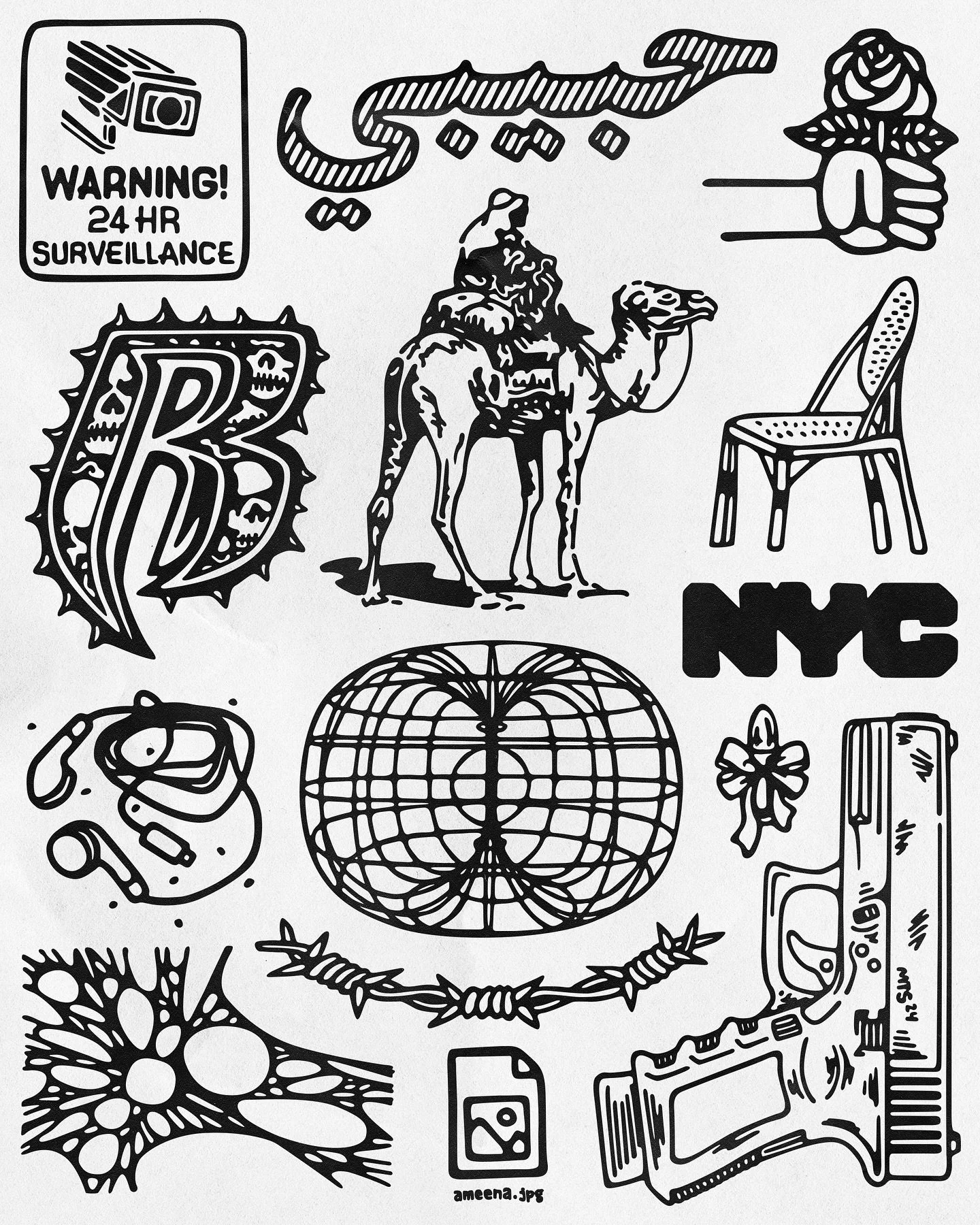
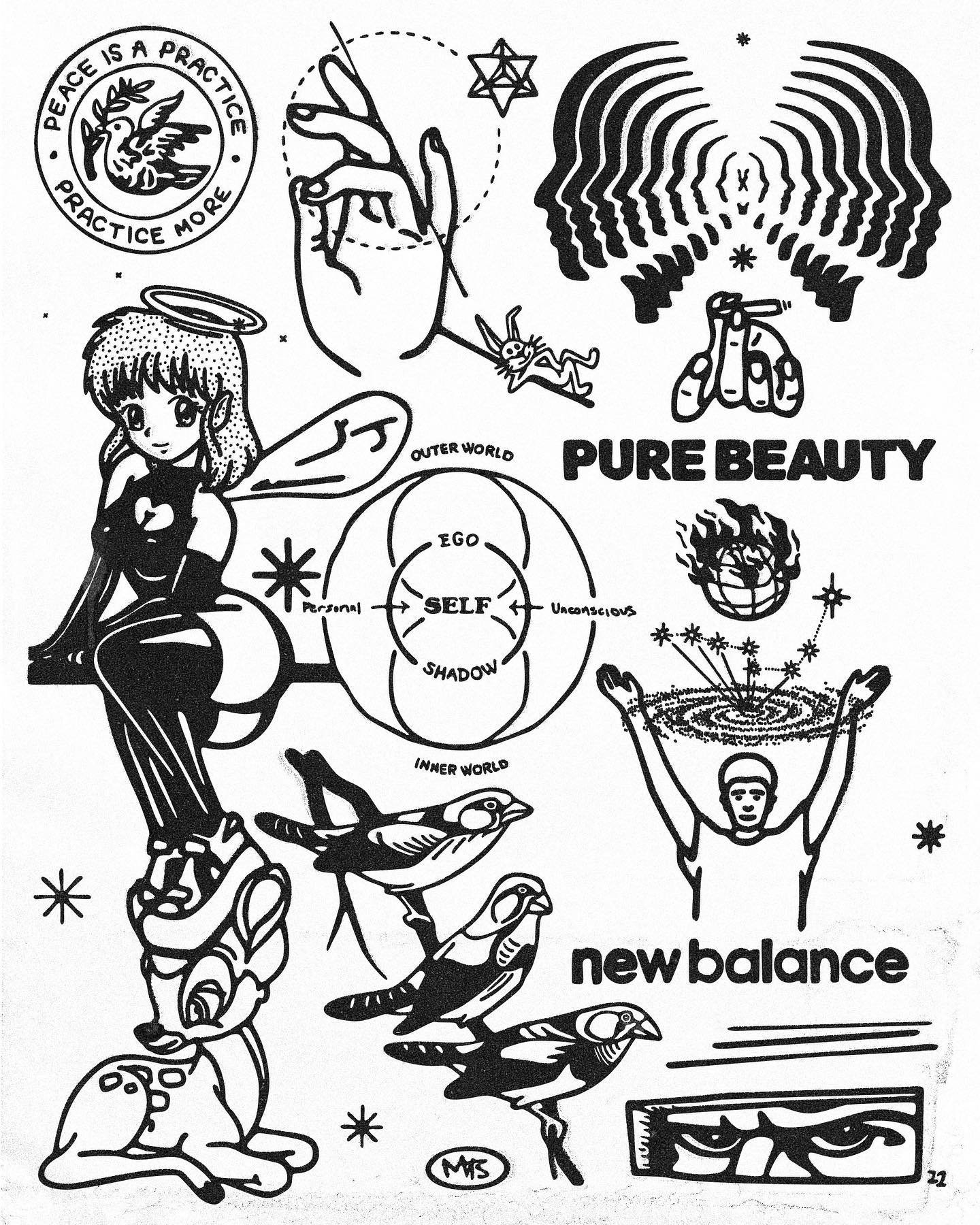
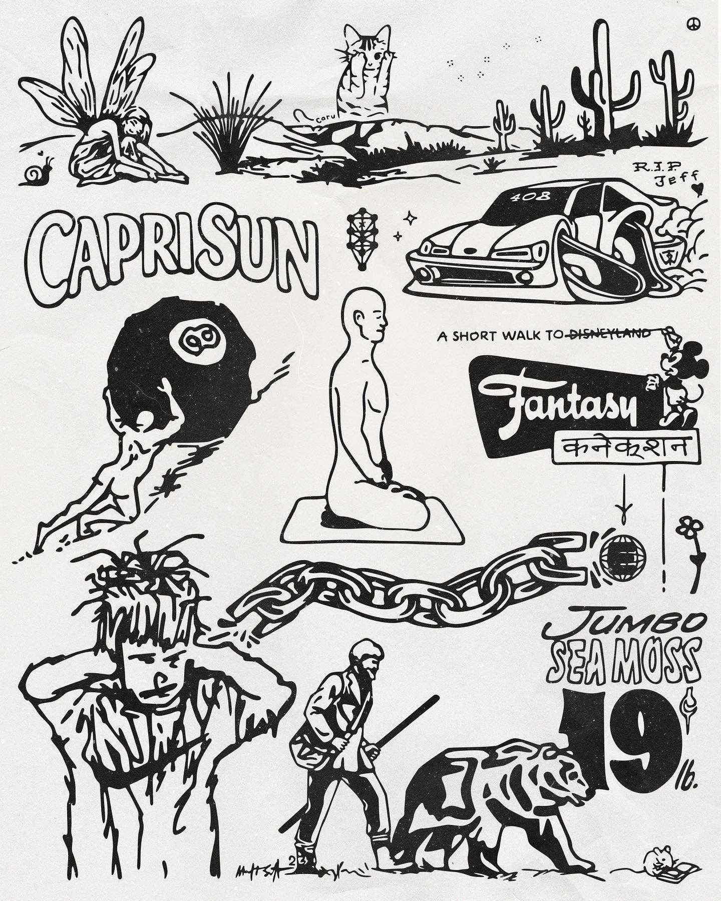
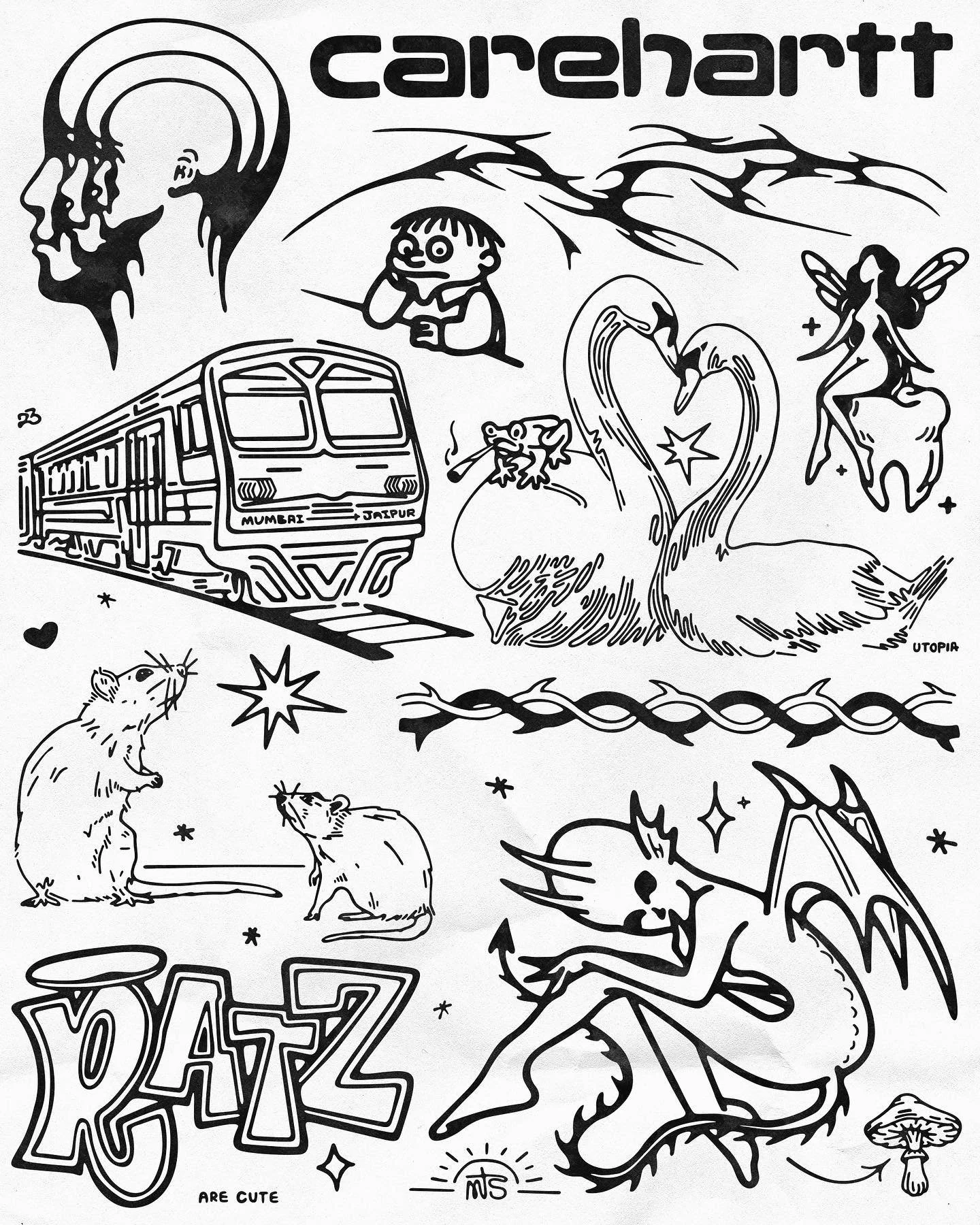
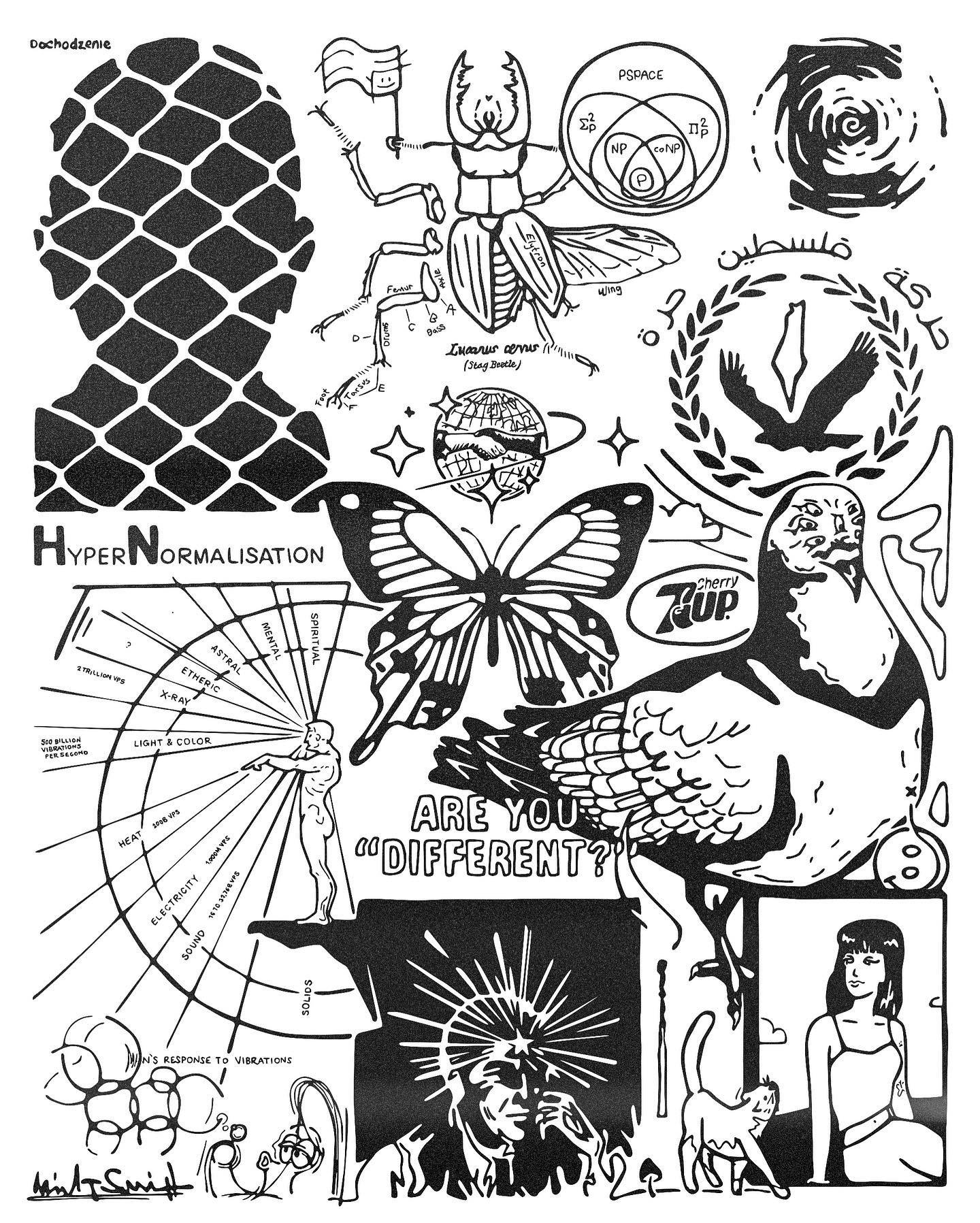
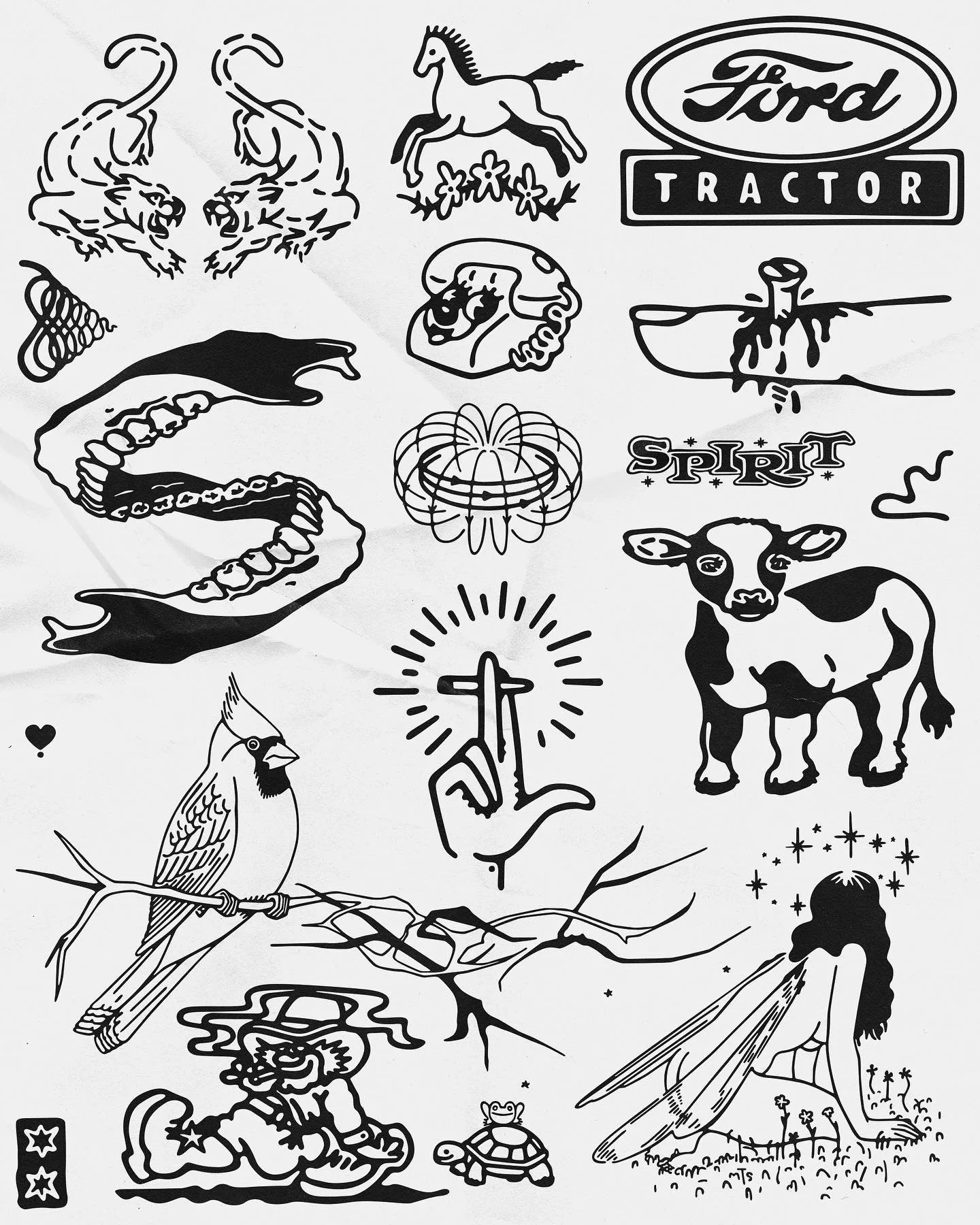
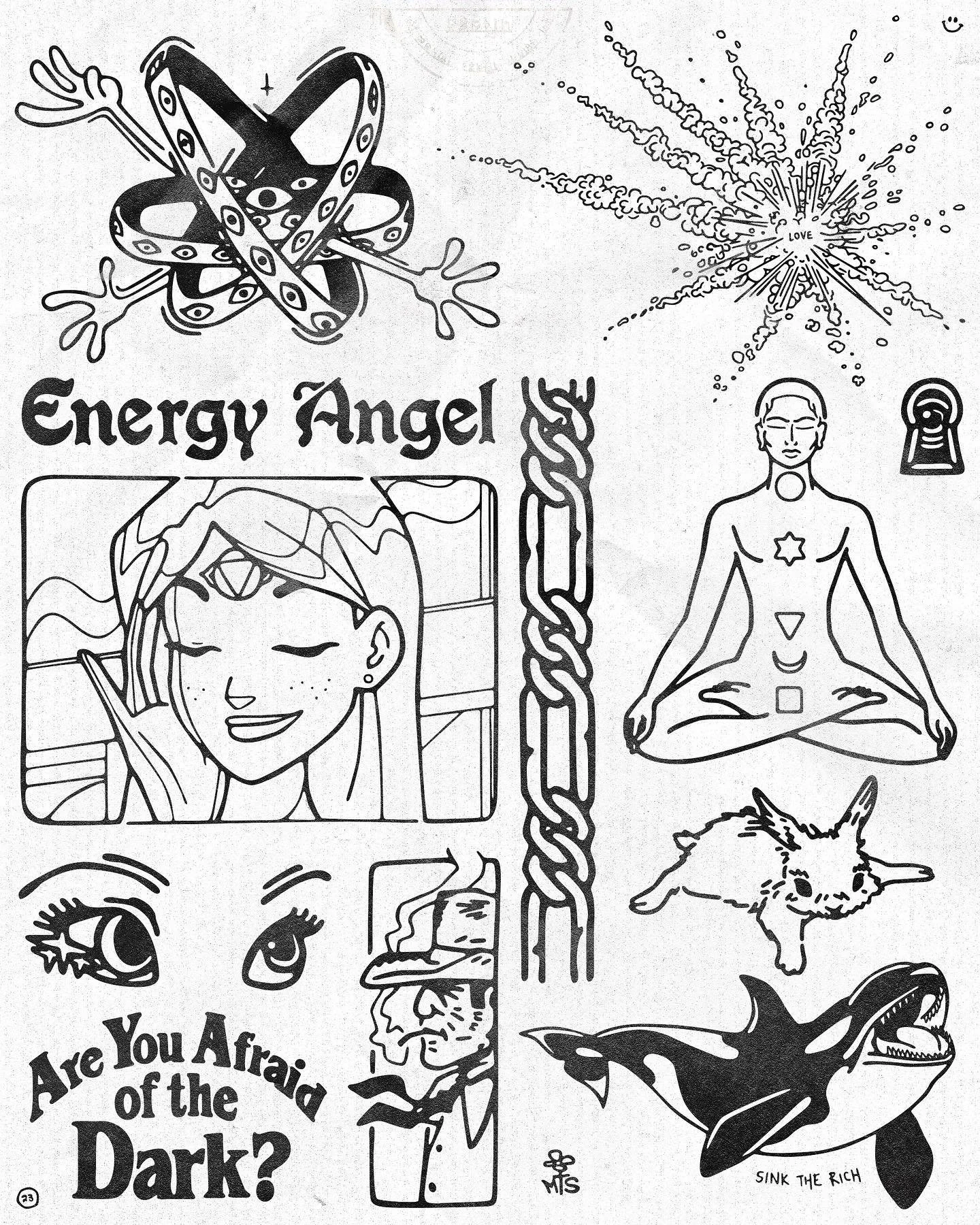
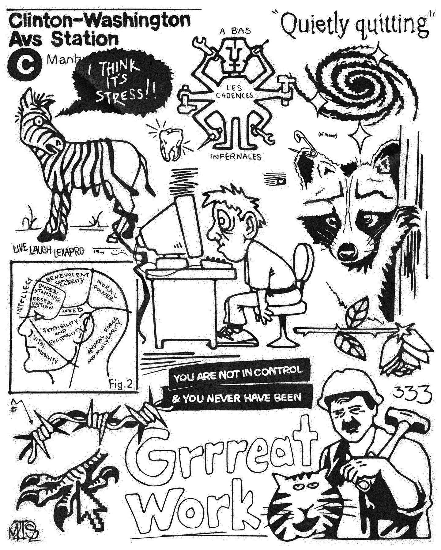
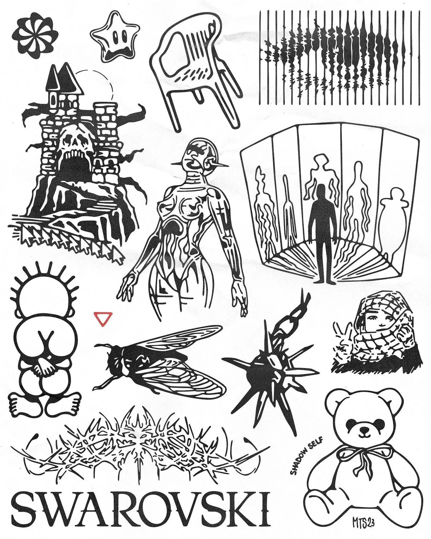
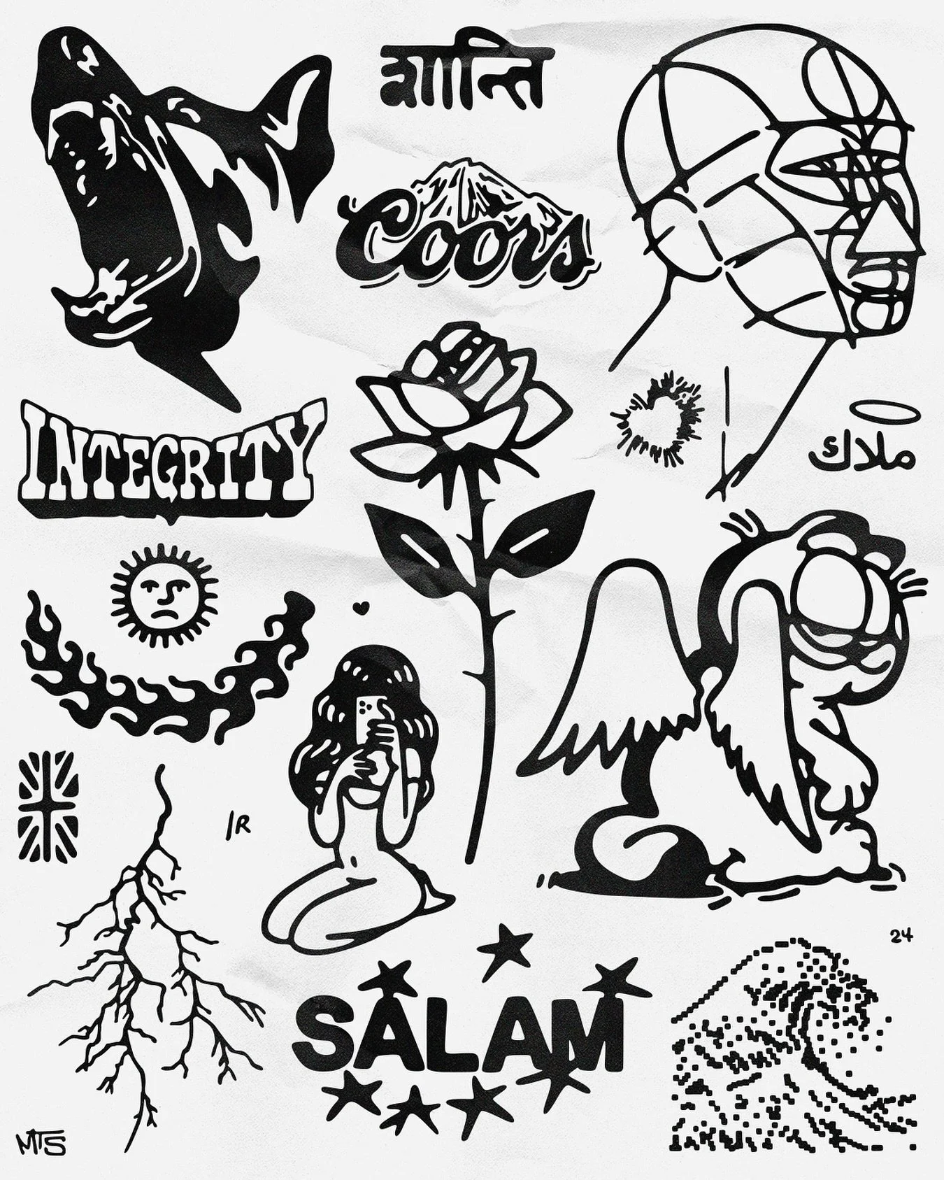
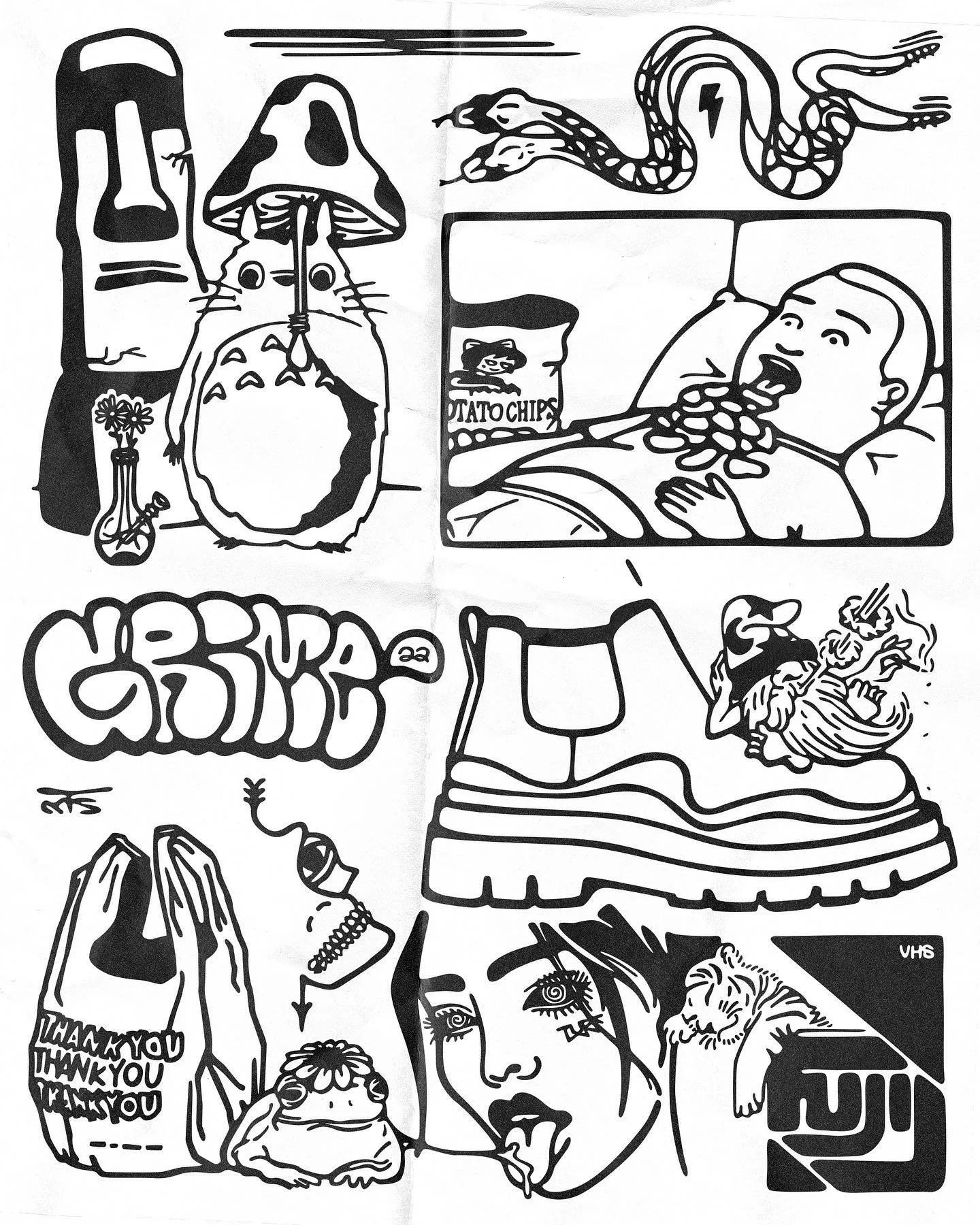
I treat a page the way Adam Curtis treats a timeline: everything's connected, nothing gets to be precious. Tattoo flash sheets, Lichtenstein's bold line, surveillance, brand logos, iconography, anime, ephemera, political slogans, all rendered flat and equal, all fighting for the same real estate.
I've always drawn. The references come from everywhere, city life, nature, tattoo culture, pop culture, vintage signage, the internet's whole visual junk drawer, and I don't rank them. A Coors logo sits next to a beetle's anatomy sits next to a question about whether you're actually different. That's the point: flatten everything to the same line weight and the hierarchy a culture insists on just disappears. The imperfection in the line is intentional too, hand-drawn means it's never quite symmetrical, and symmetrical isn't the goal. Below is a sample collection of what comes out of that.