ORION ENERGY PARTNERS: REBRAND

For your money to reach tomorrow, the planet has to make it through today. That's the whole thesis of conscientious infrastructure investing, and the category is too creatively flat to say it with any conviction.

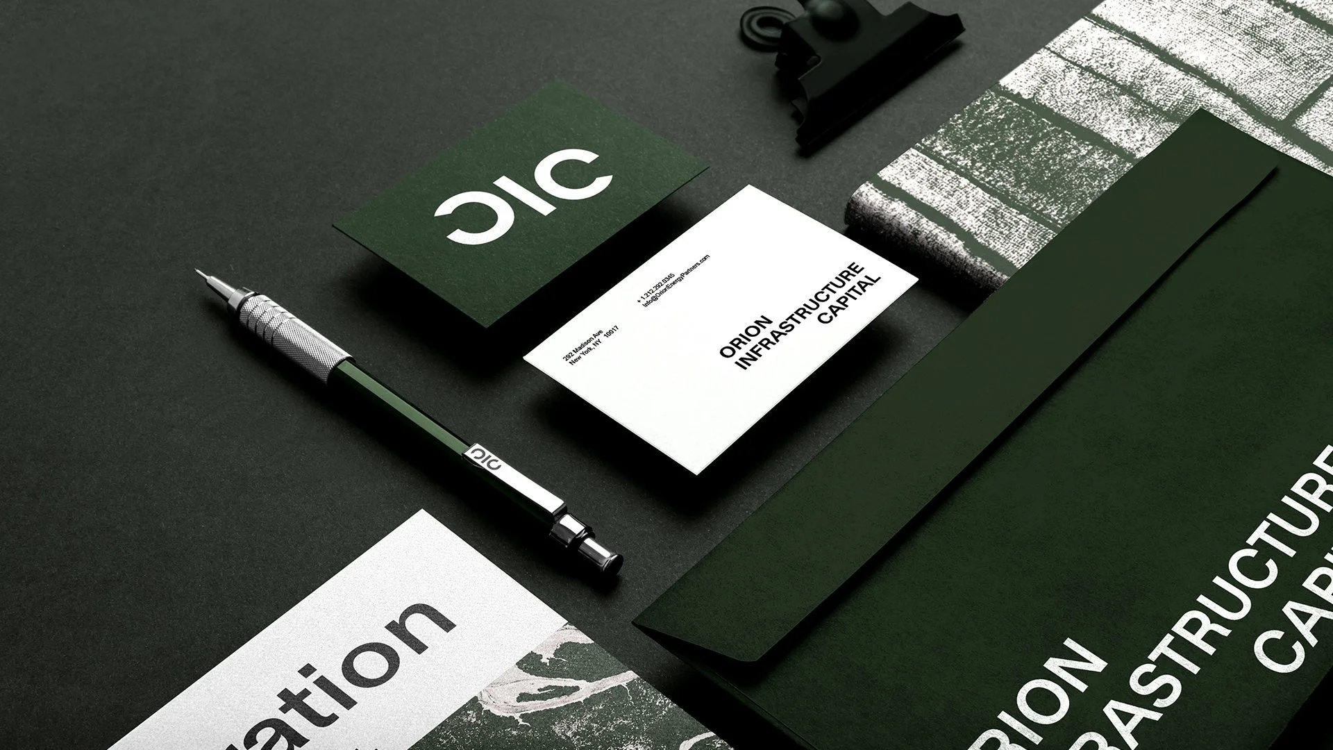
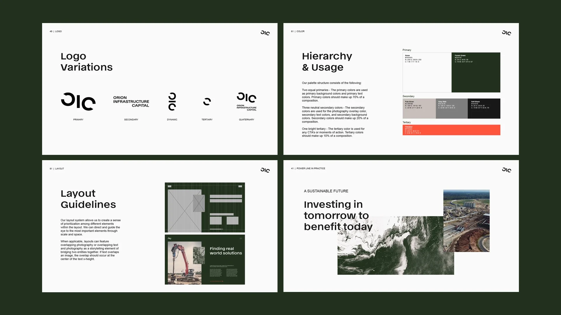
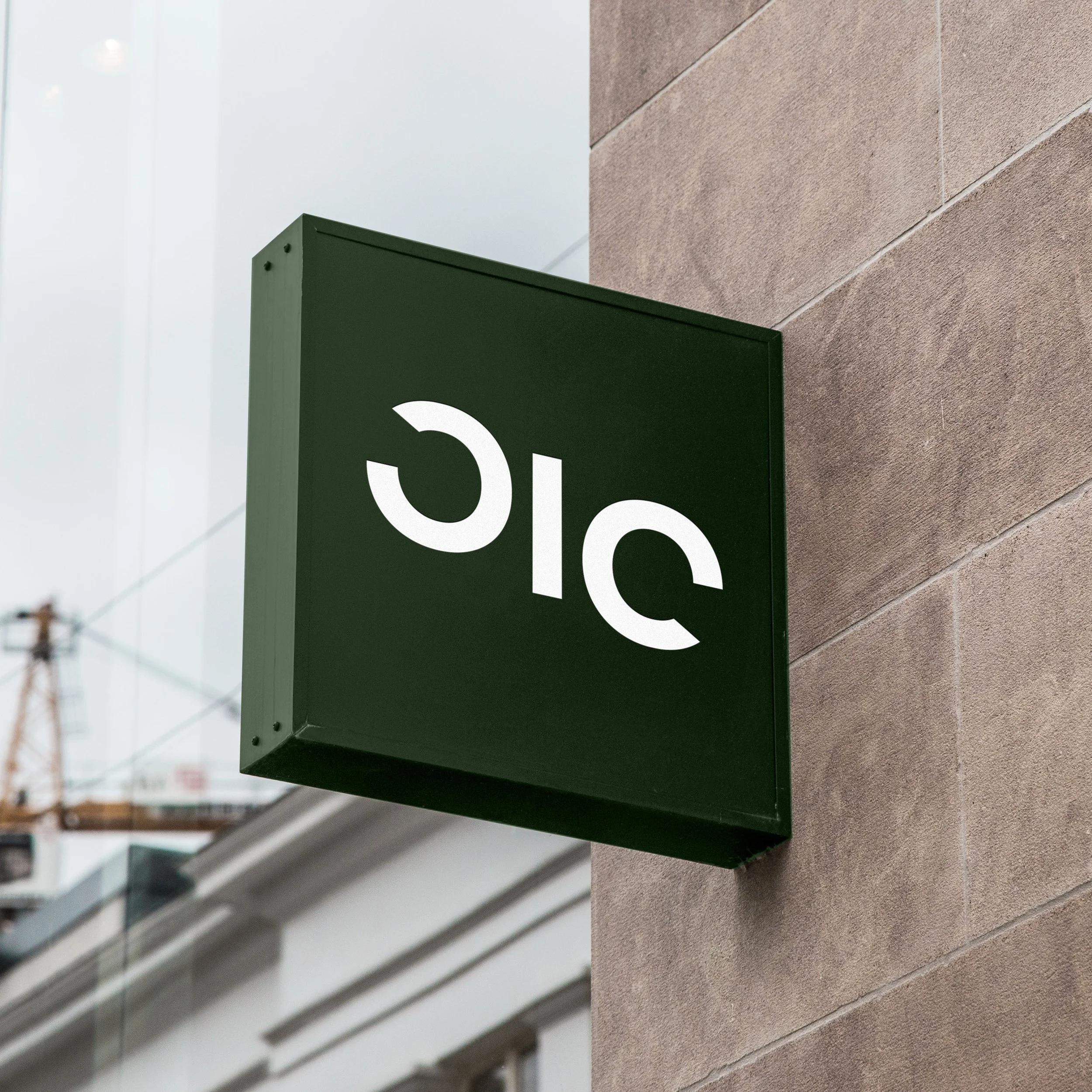
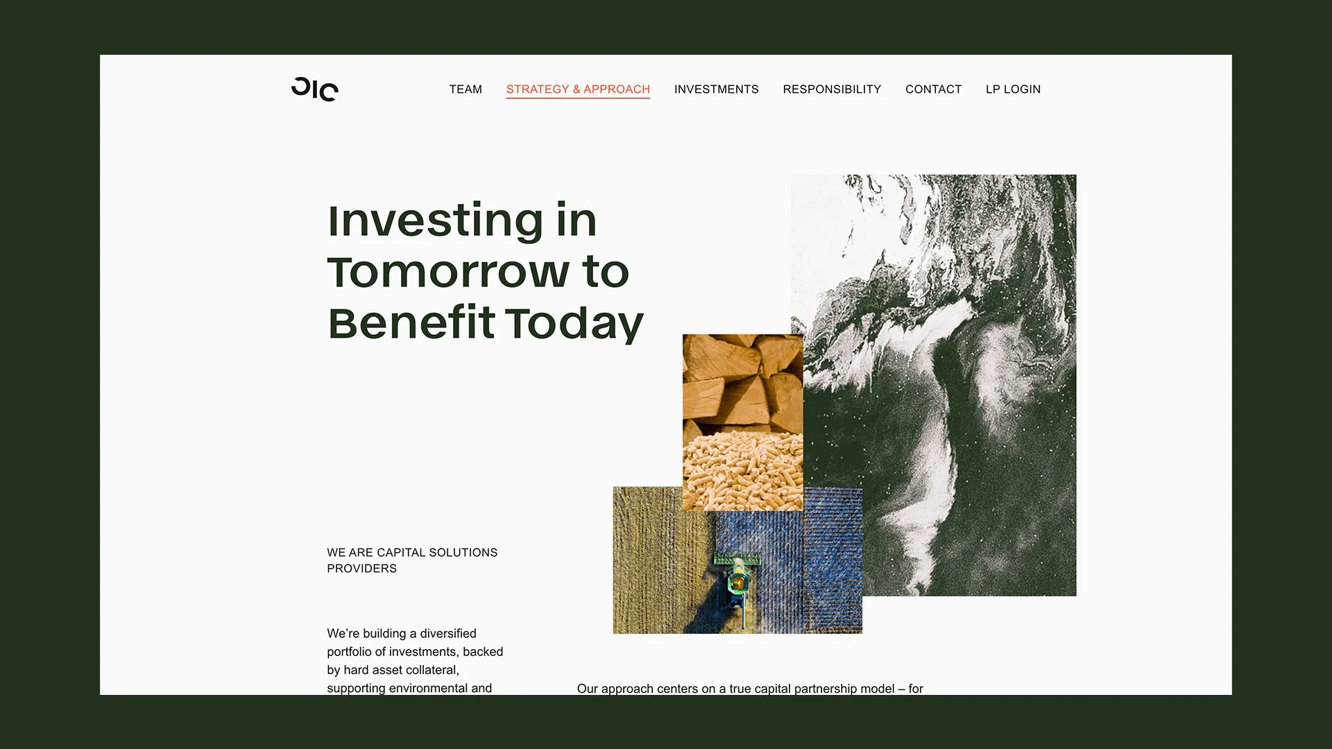
So we renamed Orion Energy Partners to OIC, Orion Infrastructure Capital, and built the brand from the acronym out. Identity, system, voice, and a site, with 90-plus pages of guidelines to keep it intact as it grew.

A finance brand that looked like it actually believed its own thesis. Rare in the room it walked into.

A dark green and white business presentation or branding setup on a black surface, including a pen, business cards reading "ORION INFRASTRUCTURE CAPITAL," a black binder clip, textured and printed materials, and green folders.
Screenshots from a presentation or document showing logo variations, color palette, hierarchy and usage, layout guidelines, and an environmental project with an Earth image and construction photos.
Aerial view of densely clustered trees with white foliage against a dark green background.
Close-up of a green sign with part of the word 'public' visible, mounted on a beige brick wall, with a window and blinds in the background.
Close-up of a black fabric surface with the brand logo 'Giq' printed in white.
A MacBook Pro laptop with its screen turned on, displaying a blank white background, placed on a wooden table.
Screenshot of a website homepage with a dark green border and white background. The header includes a logo and navigation menu with links to Team, Strategy & Approach, Investments, Responsibility, Contact, and LP Login. The main section features the large text "Investing in Tomorrow to Benefit Today" alongside a collage of images including stacked wood, wood chips, a field, and earth from space.